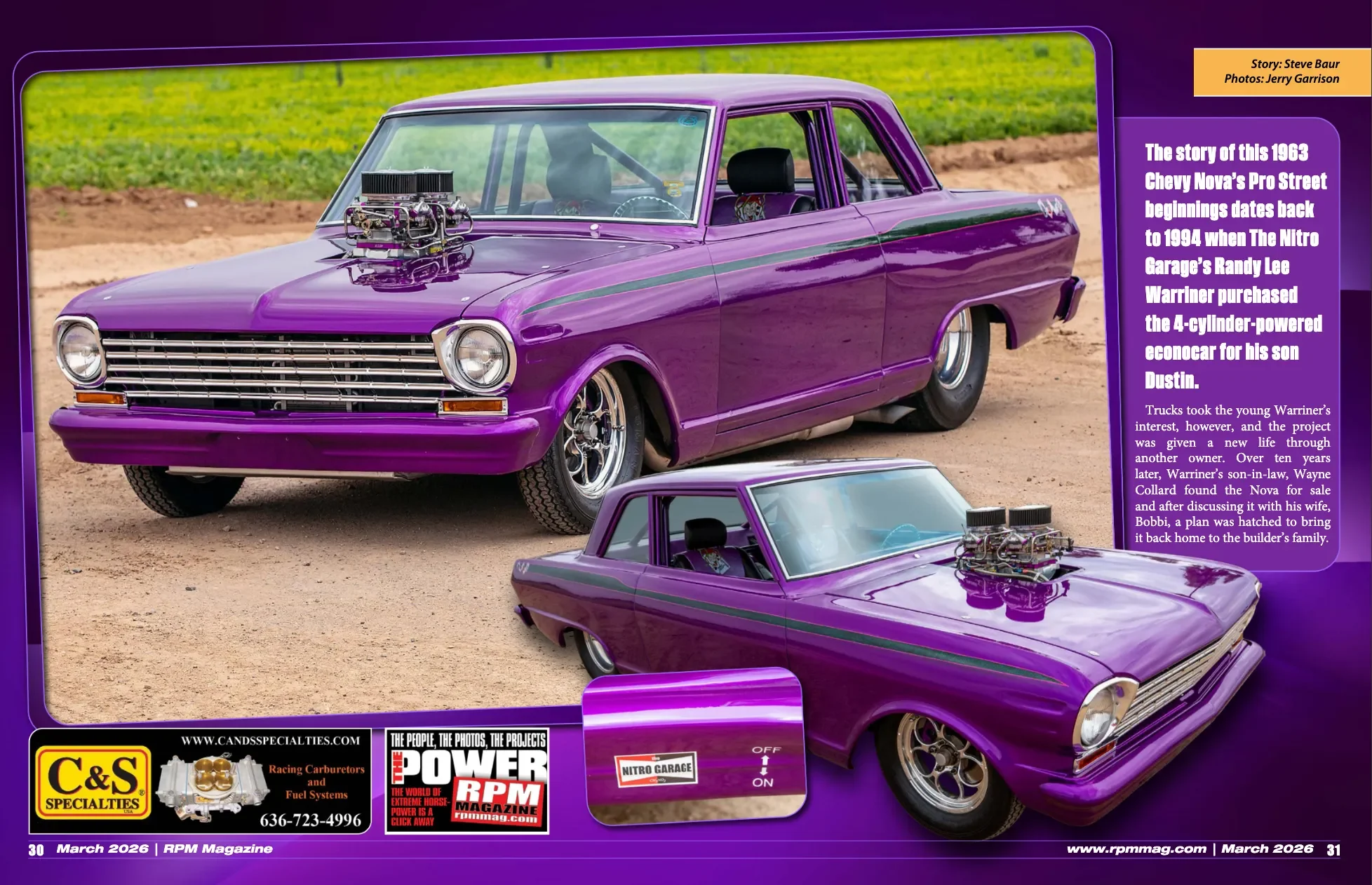
Description
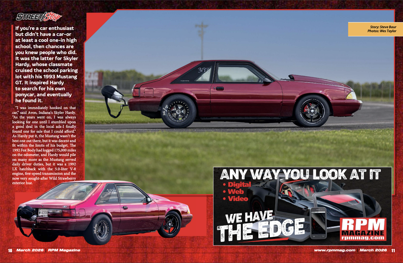
For this project, I redesigned a spread from an existing magazine that I felt needed revising. I chose to redesign a spread from a magazine called RPM Mag. RPM Magazine is a car magazine where the goal is to make people want to buy specific types of cars based on appearance and features.
Challenge
To organize and refine the elements of the spread in terms of hierarchy, color palette, imagery, and how all the elements work together.
Solution
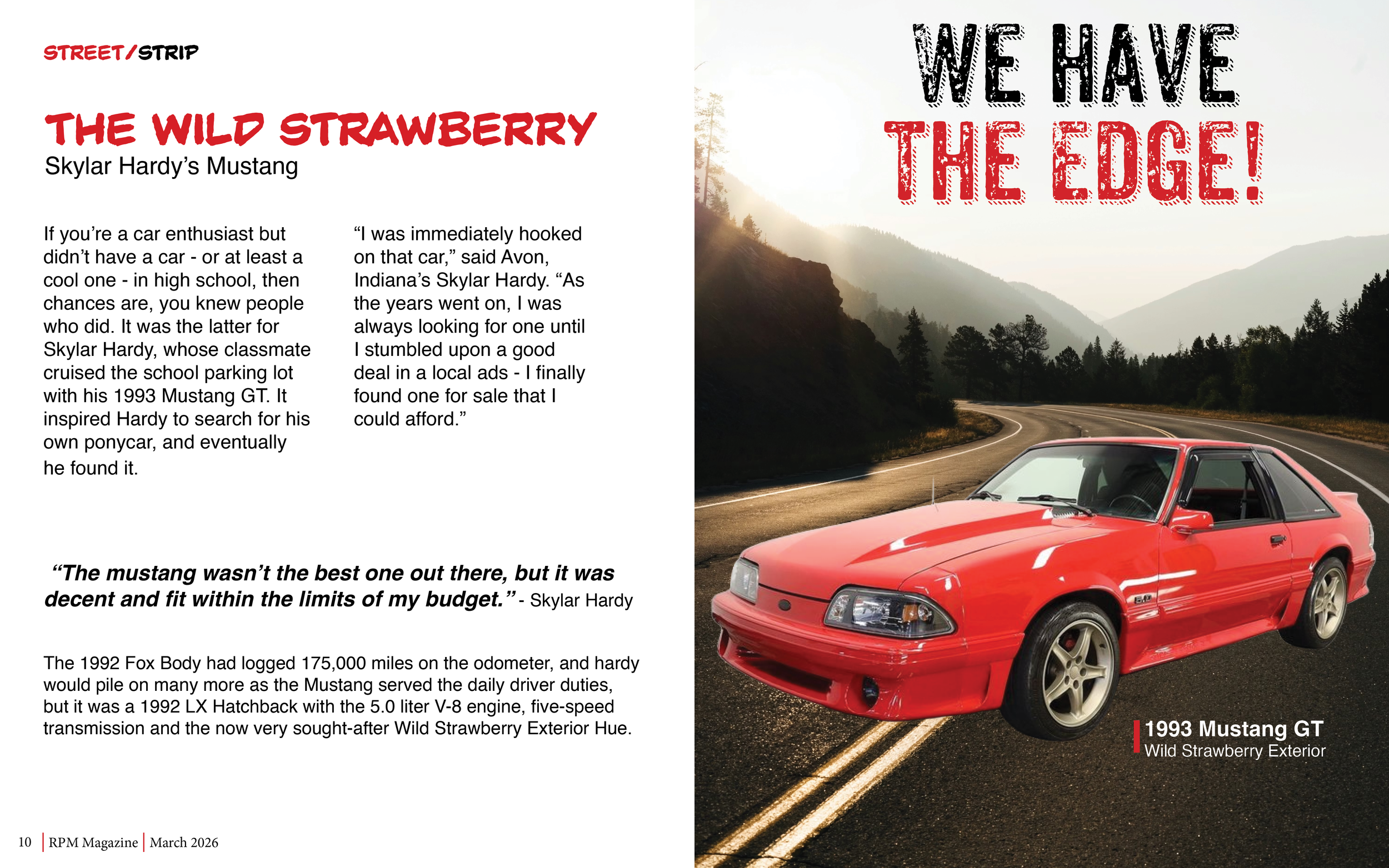
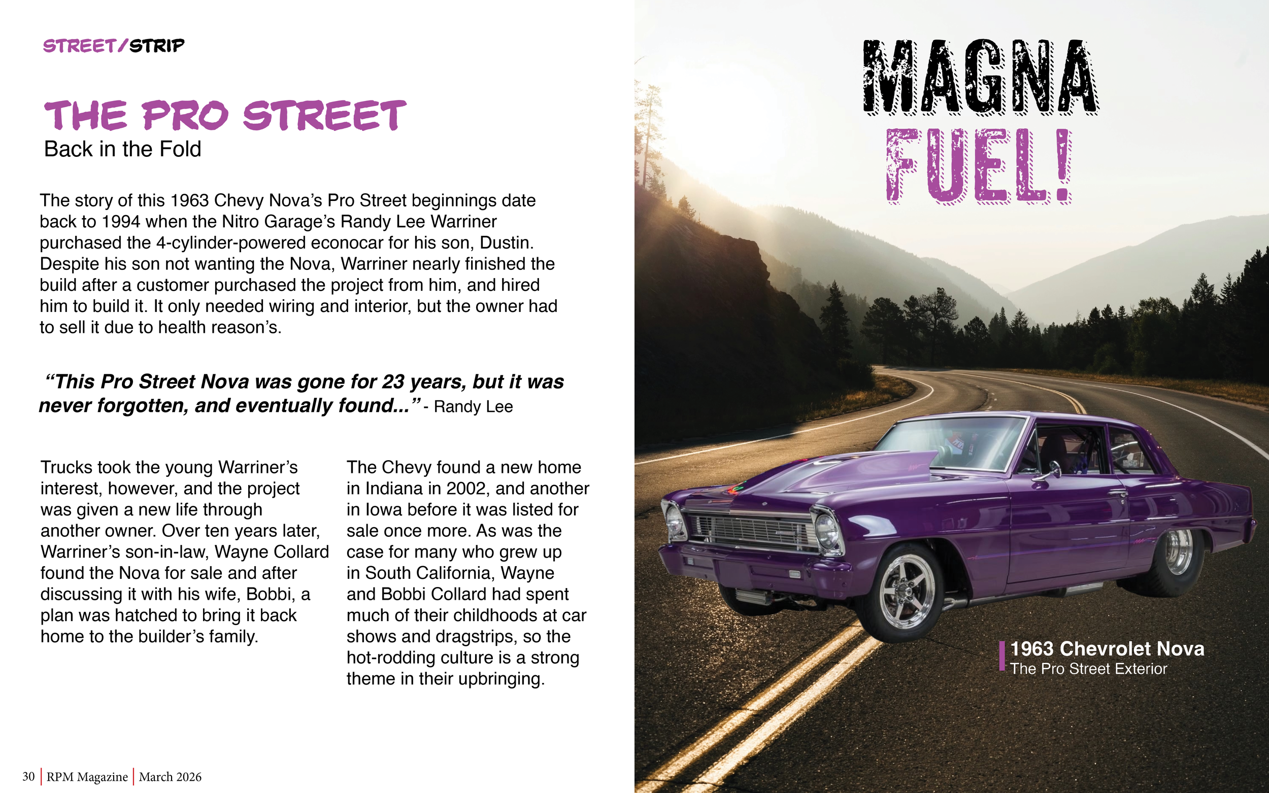
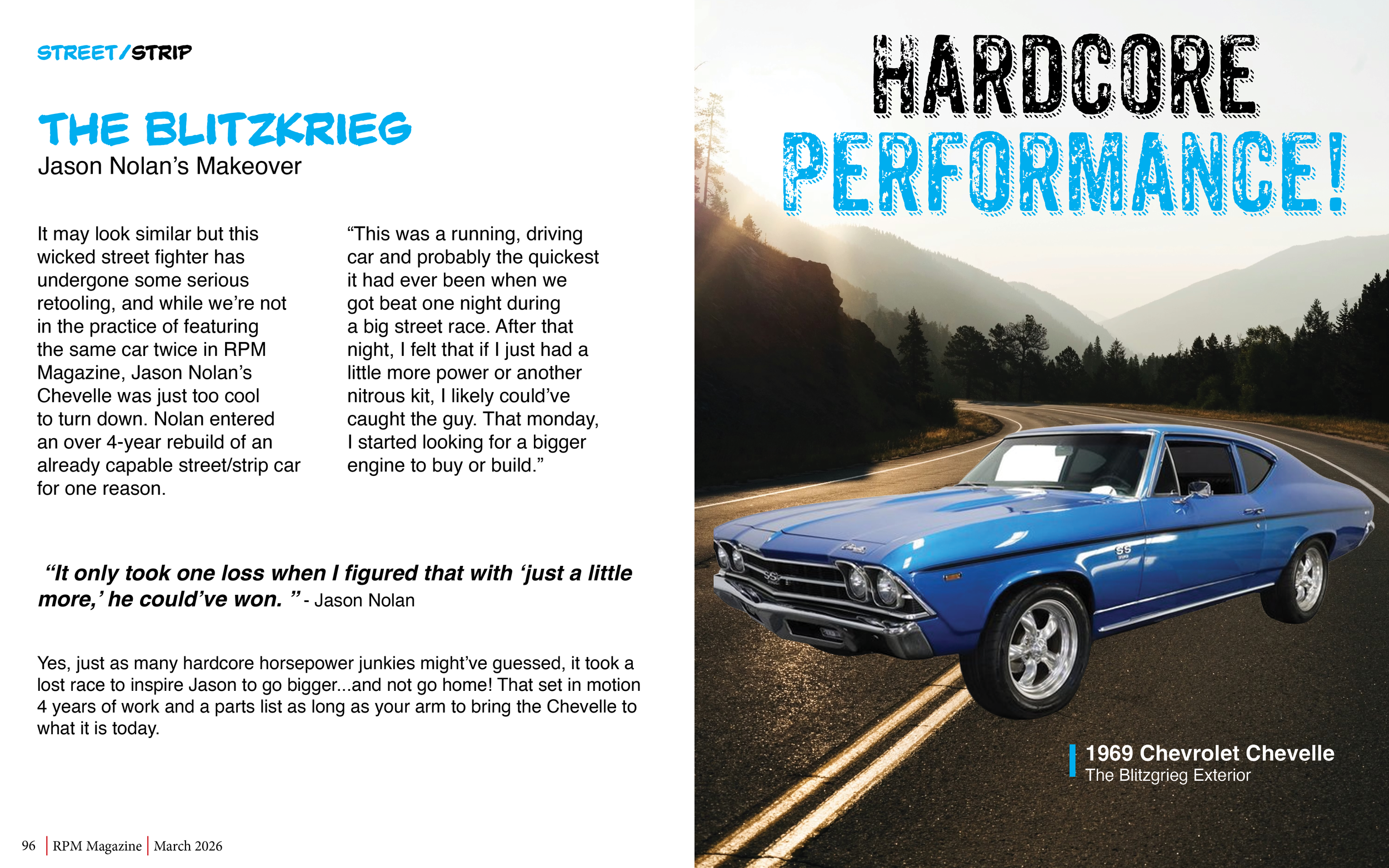
For my redesigns, I decided to separate the image to a separate page. I also changed the background color where the type was from bold colors to neutral colors to make it easier to read and make it look more professional. I also made sure to break up the type so that would be easier to read instead of being all together. Also, to separate parts of the type, I made certain parts bolder and different colors. As for the imagery, I decided to make the car look like it was on a road. Overall, the designs feel more clean, organized, and intentional.